

Monday, 22 December 2014
Saturday, 20 December 2014
Ancillary production pitch - Julie
In 5 words describe the overall theme/style of your ancillary products?


- Monochrome
- Pop of colour
- Bold
- Girly
- Fun
How many panels will your digipak have?
My digipak will have 4 panels.
Where will your magazine advertisement be placed?
My magazine advertisment will feature in magazines such as We Love Pop. We Love Pop is a monthy magazine for pop loving teenagers (our target audience) which has a range of things from interviews, posters and pictures. They feature pop artists such as Olly Murs, Cheryl Cole, Jessie J who are British pop artists. It would be suitable to have my advert in this magazine as it will attract fans of similar genre.
Where will you get your ideas from?
I'll gain inspiration from our existing ancillary products from those in the pop genre.
Wednesday, 17 December 2014
Planning Ancillary Products: List of Ideas
Possible fonts:

Colour theme:
Possibly red but with some transparency because bright red looks very tacky as it is a primary colour. I want to use lots of dark colours with writing so that our artist really stands out with her colourful clothes etc.
Layout ideas:
 I will use a small picture of the album cover and have the reviews underneath it. Then I'll make sure the artist name is larger than the album title but they should be together somehow. I must have advertising such as iTunes and HMV too.

Colour theme:
Possibly red but with some transparency because bright red looks very tacky as it is a primary colour. I want to use lots of dark colours with writing so that our artist really stands out with her colourful clothes etc.
Layout ideas:
Planning Ancillary Products: Mock-Ups
Research for digipak ideas:


Or our artist could have a mid-shot of her side profile but she's looking directly at the camera like this. For the synergy, we could have the red bandanna tied around the arm.

This could be different because the artist is clear to see but not looking directly at the camera. She seems beautiful and angelic - very feminine. The font is simple and the photo is faded so the colour of the title stands out even more. I could use this as a second part to the digipak, maybe on the outside.

Using a long shot might be more effective too. The use of the black and white looks nice here and only the significant things stand out. So I could do the same and make the red lips and bandanna stand out with our artist. However, because the genre is pop maybe it's better to use more colours rather than less.
My mock up of the digipak:

It still needs some work but I've got a rough idea of the layout and how I want it looking once it is completed.
Research for advertisement:


My mock up advertisement:

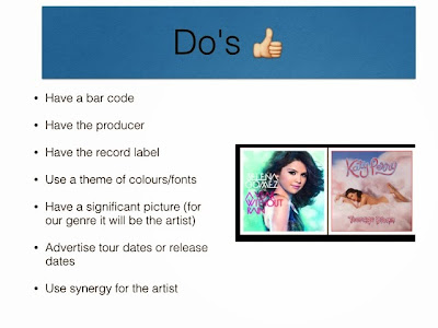
Planning Ancillary Products: Do's & Dont's
There are so many rules when producing ancillary work. Here are the do's and don'ts when making ancillary work:


Sunday, 14 December 2014

Saturday, 13 December 2014
Planning Ancillary products: Initial ideas
For my ancillary products I must make sure all of my products have a visual link. Therefore, I will follow the theme of my music video and feature the red bandana and red lips as our key synergy element. Jessie J's album 'Sweet Talker' has given me a lot of inspiration especially in terms of colour scheme

Friday, 12 December 2014
Research style, content and layout of ancillary from genre
From looking at female pop artists it is clear what the main conventions are in terms of style, content and layout...
The artist always looks directly at the camera (identifies the artist and makes them recognizable). Pop female artists always feature themselves on their digipak and advertisement, looking glamorous, attractive and sometimes even seductive.


They promote themselves as they are the main focus of their digipak. Their hair, fashion and make up has been styled well and it is clear a lot of time, effort and money has been spent to make the female artists aesthetically pleasing and even an idol to other females. The background isn't too busy, it tends to be one colour with a faded gradient or scenery such as flowers/greenery.
The name of the artist is the biggest, boldest and stands out so the audience know who the artist is. The font of the artist tends to differ to the album title. However most artwork features two fonts as a maximum. The fonts used are clear so the audience can easily engage with the artist.
Some album artworks are black and white but have one colour that significantly stands out (gold tend to be the popular).


The artist always looks directly at the camera (identifies the artist and makes them recognizable). Pop female artists always feature themselves on their digipak and advertisement, looking glamorous, attractive and sometimes even seductive.
They promote themselves as they are the main focus of their digipak. Their hair, fashion and make up has been styled well and it is clear a lot of time, effort and money has been spent to make the female artists aesthetically pleasing and even an idol to other females. The background isn't too busy, it tends to be one colour with a faded gradient or scenery such as flowers/greenery.
The name of the artist is the biggest, boldest and stands out so the audience know who the artist is. The font of the artist tends to differ to the album title. However most artwork features two fonts as a maximum. The fonts used are clear so the audience can easily engage with the artist.
Some album artworks are black and white but have one colour that significantly stands out (gold tend to be the popular).
Thursday, 11 December 2014
Previous Student Work Analysis

The artist's name is always bold and stands out, making it very important in both the advertisement and digipak. The list of songs are clear and the digipak includes all the conventions such as a bar code, record labels, and the spine of the digipak is constructed properly too.
The advert uses the same fonts too and the use of the release date and other resources such as iTunes and HMV works well too.

The graphics and special effects allows the digipak and ad look even more electronic and we see the artist with a bandanna around his face too, perhaps illustrating a "gangster" or "bad boy" theme in his songs.
The list of songs are also effective because they relate to the genre. The bar code and record label etc. are all there too.
Research Ancillary Products: Design Activity

Using Photoshop Elements, I made a digipak using a random picture off the internet. It was difficult to make it because I had to use the picture in such a way, that it portrayed an artist and their music. I used the colour of her lips to create a synergy of red with her name. I also reduced the opacity of the picture so the text was clear and the picture had a softer filter. It is a close up of her so it was important not to put any writing on top of her face. The red was continuous through out the digipak.
The font was simple and I manipulated the sizes of her name and the album name so it was obvious which was important. The list of songs denotes emotion, love and typical female pop songs. I used a bar code and the name of a record label because that is conventional for a digipak. The spine (middle part of the digipak where it folds) needed the album and artist name too, along with the record label.
Although it is not finished, it helped me to realise what is needed for a digipak and how difficult it really is to follow the conventions for a digipak, depending on specific genres.
Previous student ancillary work
Group 11
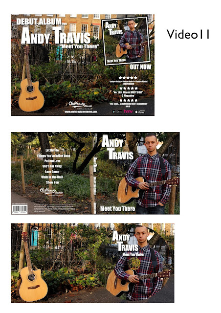
Group 11's ancillary work is very effective. The images chosen suit their indie genre, as it features a guitar and greenery which is seen in their music video. The artist name is clear and easily identifiable as he features across the digipak and advertisement. This allows the audience to connect with him and it's clear he is the artist. The back of the digipak includes all the additional information needed, making it look professional. The font is simple and they used white writing which stands out from the naturalistic background. They've kept it overall simple, with no unnecessary effects. There is a clear visual link between all products.
Group 21
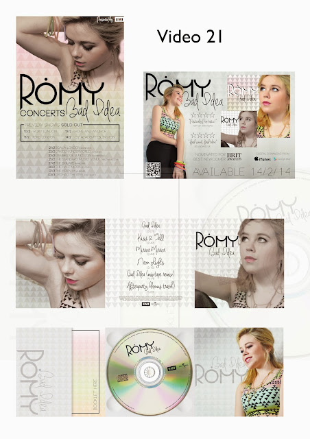
Group 21's ancillary work is also highly effective. It looks extremely professional due to the tile effect used in all of the products, the font for the artist name 'Romy' stays the same and is effective for this genre. There are a range of pictures used but not too many or unnecessarily. The advertisement includes tour dates clearly, which introduces her as an artist. The colour used is suitable for the genre, it's colourful but the grey tiling helps to neutralise that. It has all the additional information on the back of the digipak, I particularly like the font they've used for the track listing, it's stylish but not unreadable. Group 21 have successfully created a visual link in all their products.
Group 11's ancillary work is very effective. The images chosen suit their indie genre, as it features a guitar and greenery which is seen in their music video. The artist name is clear and easily identifiable as he features across the digipak and advertisement. This allows the audience to connect with him and it's clear he is the artist. The back of the digipak includes all the additional information needed, making it look professional. The font is simple and they used white writing which stands out from the naturalistic background. They've kept it overall simple, with no unnecessary effects. There is a clear visual link between all products.
Group 21
Group 21's ancillary work is also highly effective. It looks extremely professional due to the tile effect used in all of the products, the font for the artist name 'Romy' stays the same and is effective for this genre. There are a range of pictures used but not too many or unnecessarily. The advertisement includes tour dates clearly, which introduces her as an artist. The colour used is suitable for the genre, it's colourful but the grey tiling helps to neutralise that. It has all the additional information on the back of the digipak, I particularly like the font they've used for the track listing, it's stylish but not unreadable. Group 21 have successfully created a visual link in all their products.

Design activity


Researching Ancillary Products: Analysis of 3 Digipaks/Adverts
Delilah - From the Roots Up
- Simple colours (black, white and grey)
- Use of the triangle allows her to be the main focus
- The play on words with"roots" (hair and her roots as in where she's from)
- The font seems very 'techno' - could be a link to one of her songs
- Side profile of the artist makes it seem simple but we still see her clearly
- Artist's name is conventionally the biggest and stands out the most
- Ratings are there (all of high standards)
- The hair is chopped off in the digipak but it has white ends on the advertisement so maybe we have to see the album to see what happens to that hair later on
- There's a link with the hair and the artist's body as a synergy

Labrinth - Electronic Earth
- Dark backgrounds so the artist stands out the most
- Contrast of dark backgrounds with vibrant text and images
- Use of special graphics on artist's picture - electronic theme (link to album name)
- Close up of artist (allows engagement with audience)
- Fonts are very techno/electronic (like space)
- Advertisement is very different to the digipak - more vibrant (gets attention)
- Main colours are blacks and dark blues/purples
- Advertisement using iTunes
- One review but very high - importance emphasised using bright yellow colour
- The first advert has a synergy link with the shades the artist wears


Cher Lloyd - Sorry I'm Late
- Continuous font - feminine but still clear to read (stylish)
- Colours: turquoise, cream and purple
- Mid-shot of Cher on the album cover, smoking (makes her look bad - links to album name)
- Using telephone to link colours and possibly use it as a prop
- Close-up of her on the advert helps to engage with the audience
- She uses her own quote showing that she was excited herself to release the album
- Artist name and album name are larger than the rest
- The synergy between the digipak and advert would have to be the fonts and her hair colour


Wednesday, 10 December 2014
Monday, 8 December 2014
Researching Ancillary products: Function of a digipak to the music industry
A digipak is a modern approach to CD packaging, typically cardboard with a plastic disc that holds the CD itself. It normally has bonuses included that fans would not have if they didn't buy the CD.
The function of a digipak is to:
The function of a digipak is to:
- Add value to an album
- Encourages us to part with money
- Be a bonus to a loyal fan's collection
- Increase popularity of the artist
 |
| This is an example of an exisiting digipak. This one has 6 panels and an additional leaflet which is special to the digipak. |
Friday, 5 December 2014
Production of Music Video: Progress Review Blog
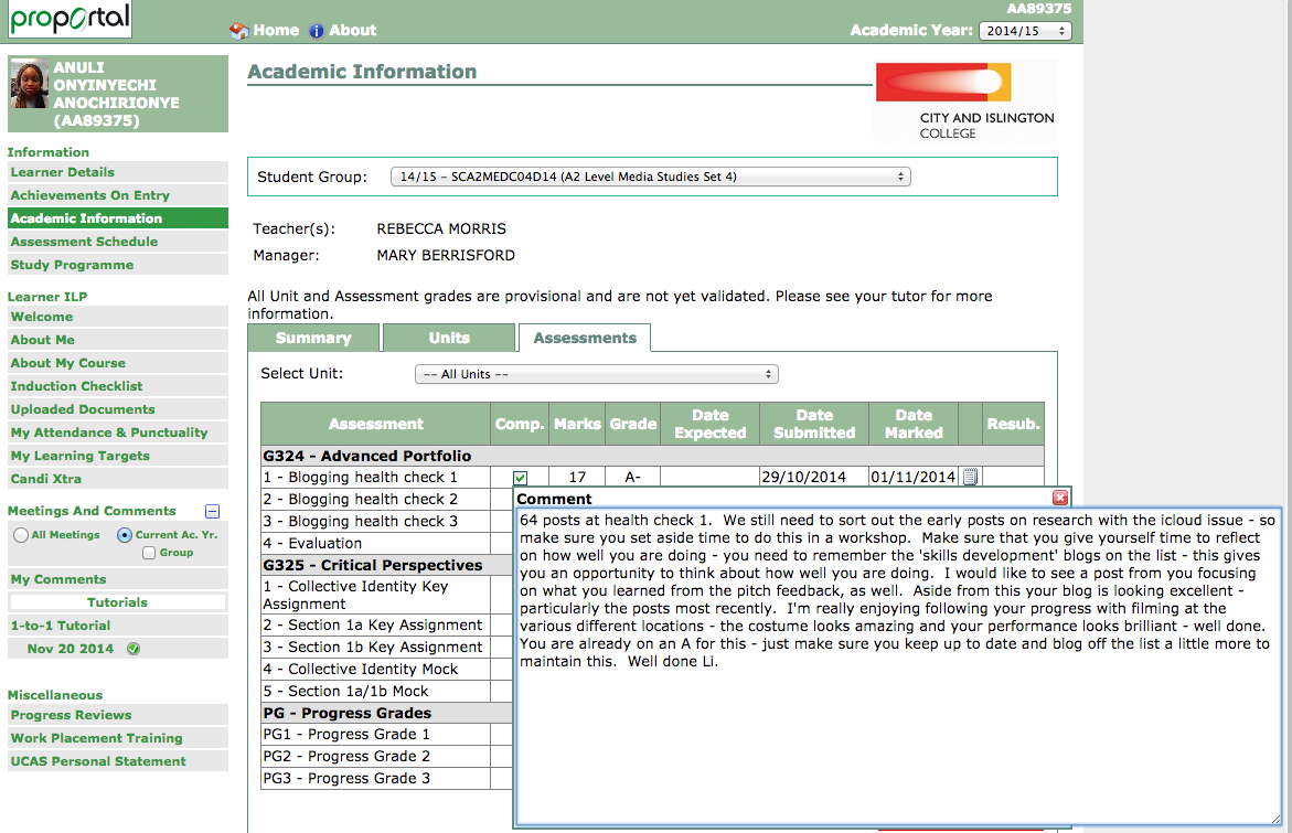
 How has my blogging developed?
I've got a wider range of media technologies I use when presenting my blogs instead of just text and pictures. I have continued to put in more detail and kept it all relevant to the work in A2 Media.
How successfully did I detail everything?
I made sure all the blog posts for research, planning & the construction were labelled clearly. I kept it relevant to the questions asked and I made it clear to someone who may be seeing our blog for the first time. At each step of the making of the music video, it was clear what we were doing, especially if anything changed. My blog posts have been produced in such a way that anyone would understand what is happening, no matter how late they came to see what we were doing for our music video production.
How happy am I with my individual blogging so far?
I am extremely pleased with not only the quantity of blog posts I have produced, but also the quality. I have managed to post full posts full of detail. However, I know I have managed to go over board with some blog posts. Even though I deleted some irrelevant posts, I need to be careful I don't over-blog because some posts aren't that important. I have managed to have a balance of individual work and group posts, and made sure I put the same effort in both so my whole blog overall is to an excellent standard.
How many individual blog posts do I have?
I have 45 posts that I have posted on my own and I am pleased with the detail & quality of each and every one.
Thursday, 4 December 2014

Production of music video: Progress review blog

My blogging work has developed a lot since the start of A2 media. I think I have successfully posted detailed posts about the research, planning and construction stages of our music videos. My blogging health check reflects this as I have received feedback that my posts are reflective and detailed which is what I have been aiming for. I am proud of myself for keeping on top of the blogging, and organising my time so I don't fall behind. I made sure I completed blogging tasks when they were set so I didn't have too much to do next time. I have tried to use a wide range of ICT however there is always more I can do to improve. The targets I set myself I assure I meet.
.jpg)
DEADLINE IS TOMORROW
Today, we are finishing off the music video and aim to be finished by the second half of this lesson. The music videos will be presented in the cinema in two weeks so we need to keep reminding ourselves that the video needs to look good on not only the small screens in class, but also huge projections.
Our group member Anuli got loads of feedback from students who said they loved the part with the boy and the bridge of the song worked really well. However, some teachers noticed that the boy scene wasn't in our music video enough so we need more of those which also match the beat of the bridge. Therefore, we are working on that now.
Julie and Sabiha are blogging and preparing the posts for the day and also checking through if everyone has posted what was needed, whilst Katherine and Anuli are making the final touches to the music video.
Wednesday, 3 December 2014
Self Reflection on Progress 30/11/14
From my new progress review I have learnt that I have a few blogs missing which I must do: including an analysis of the artist's website. Also I agree that I should start using different formats when uploading photos so I plan to go back on previous blogs and use either photo bucket and/or Flickr. I agree with all the points that my teacher has made and I will go back and make these changes.
Tuesday, 2 December 2014
Title Choices
Here are some options of fonts we could use for the title once we have chosen I should be able to change the colour of the font also. (More to be uploaded soon)
Monday, 1 December 2014
Making the Title, Deadline Preperation & Vlogs
 We're making our title today and we have decided that instead of filming more scenes, we will stick to the original idea of our artist's name on the screen along with the name of the song fading in. We re-shaped it and all sorts but it just didn't look good & it was difficult to find a colour for the text that stands out properly against the bandanna.
 We tried using the bandanna idea but it looked too tacky and a bit overpowering. Our synergy shouldn't be too obvious either and we have enough of the red bandanna through out the music video too. So we left that out.

We played around with different fonts but still need more ideas for which font to use. So we did some research and found some inspiration from other artists similar to ours. E.g, Little Mix's album had a distinctive and fashionable font that would suit our genre too. We will finalise the font soon.
OUR MUSIC VIDEO DEADLINE IS THIS FRIDAY (5th OF DECEMBER) AND WE STILL NEED TO FINISH THE TITLE AND EDITING. WE AIM TO BE DONE BEFORE FRIDAY SO WE HAVE TIME FOR OUR TEACHER TO WATCH THE VIDEO AND SPOT ANY LAST MINUTE FLAWS.
WE MUST:
- Highlight the file yellow so our teachers show the right one in the cinema
- Name it "FINAL EDIT"
- Add our first names in it too
Subscribe to:
Comments (Atom)