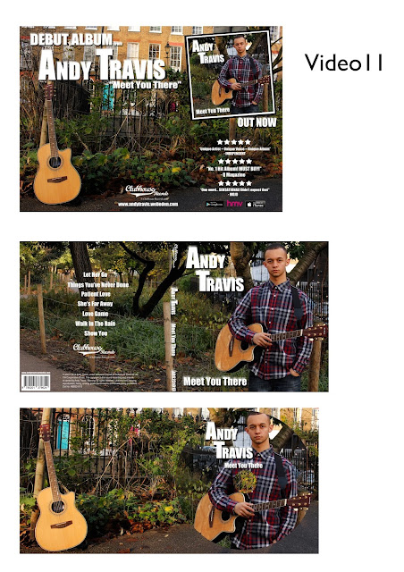
Group 11's ancillary work is very effective. The images chosen suit their indie genre, as it features a guitar and greenery which is seen in their music video. The artist name is clear and easily identifiable as he features across the digipak and advertisement. This allows the audience to connect with him and it's clear he is the artist. The back of the digipak includes all the additional information needed, making it look professional. The font is simple and they used white writing which stands out from the naturalistic background. They've kept it overall simple, with no unnecessary effects. There is a clear visual link between all products.
Group 21

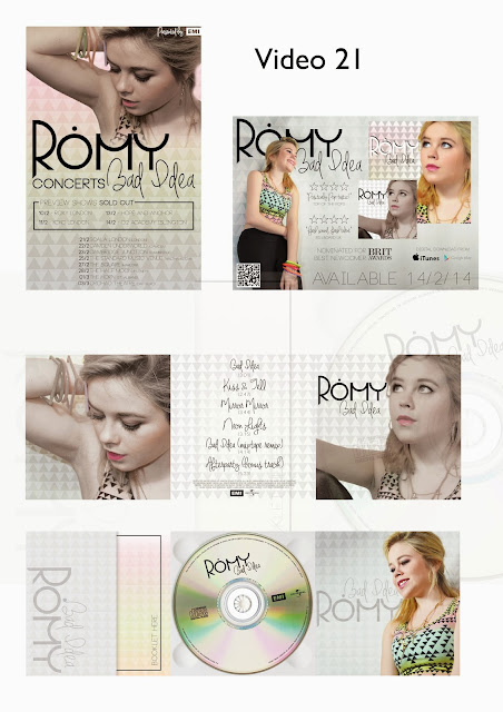
Group 21's ancillary work is also highly effective. It looks extremely professional due to the tile effect used in all of the products, the font for the artist name 'Romy' stays the same and is effective for this genre. There are a range of pictures used but not too many or unnecessarily. The advertisement includes tour dates clearly, which introduces her as an artist. The colour used is suitable for the genre, it's colourful but the grey tiling helps to neutralise that. It has all the additional information on the back of the digipak, I particularly like the font they've used for the track listing, it's stylish but not unreadable. Group 21 have successfully created a visual link in all their products.

No comments:
Post a Comment